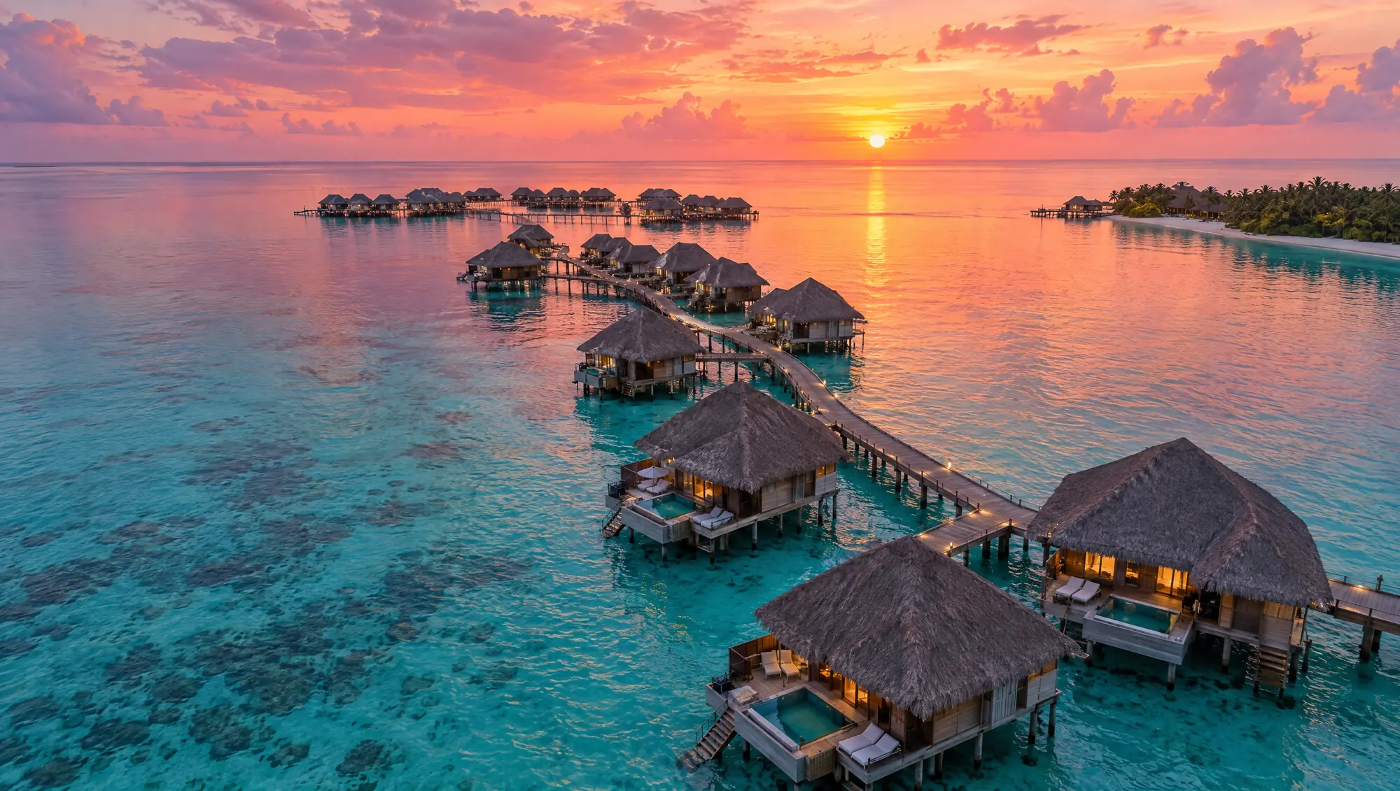
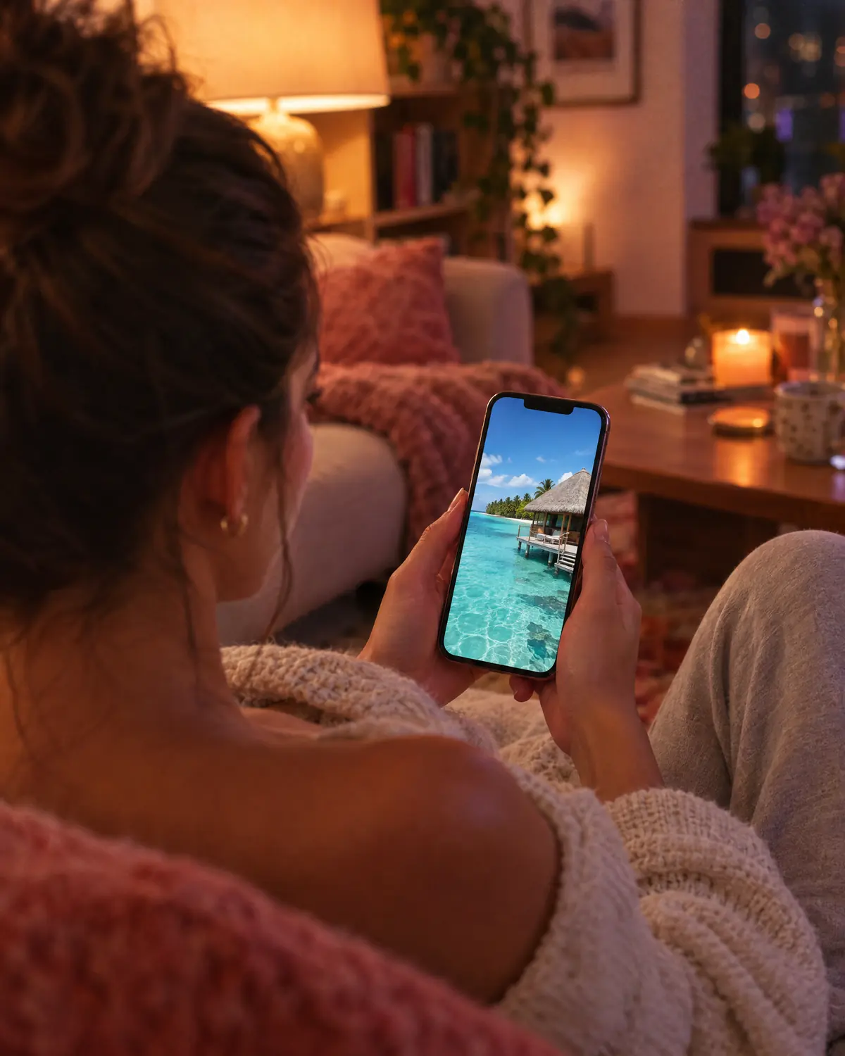
Photos that shrink the place
Rooms look smaller, views look flatter, and the feeling of being there is missing from every picture.
Creative direction for photography and video that shows how it feels to be there, along with what's in the room.

Guests take every trip twice. First on a screen, then in person. Nancy Cienfuegos designs the first one, so more of them take the second.
25+ years in brand & designReply from Nancy herselfNo obligation
Where most trips really begin
The better place doesn't always win. The one that looks better usually does.
What that costs youWhen a great property loses to a lesser one, it usually comes down to three things. Each one has a fix.
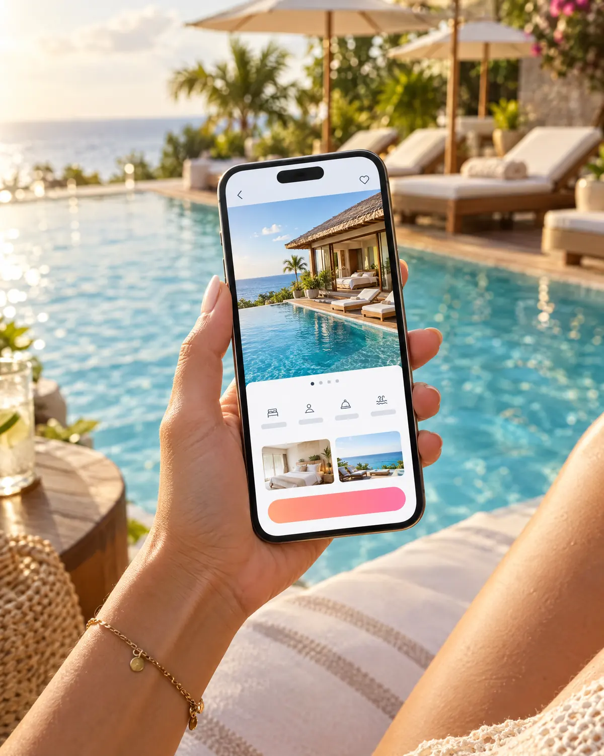
Rooms look smaller, views look flatter, and the feeling of being there is missing from every picture.
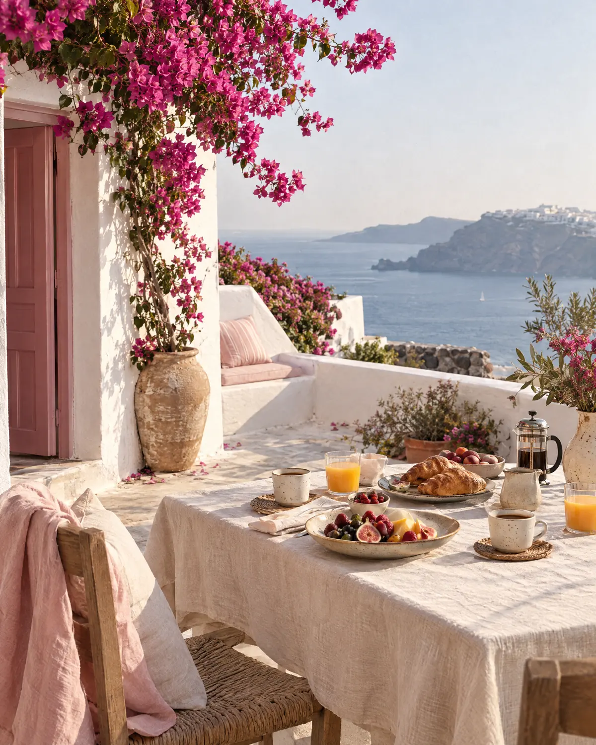
Creative direction for photography and video that shows how it feels to be there, along with what's in the room.
Guests who were ready to say yes get lost in menus, pop-ups and a booking step that looks like a different company.
One calm, clear path from first glance to booking or inquiry, designed for the phone first.
The website says one thing, social says another, and the emails look like they came from a third company.
One visual system, so every touchpoint feels like the same place people already trust.
Fix one of these and things improve. Fix all three as one system, and people start to see you differently.
How Nancy does itMost redesigns start with a new homepage. Nancy starts underneath it: what you stand for, how you look and sound, and the rules that keep it consistent. The website, the app and everything else get built on top. That's why the work holds together long after launch.
Layer 1 of 4Positioning, audience and the story guests retell when they get home.
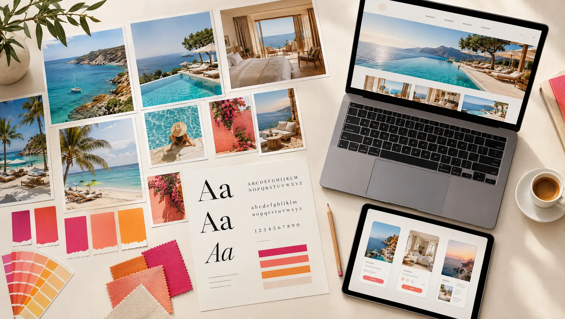
Layer 2 of 4Logo, color, type, photography direction and voice, designed for a phone screen first.
Layer 3 of 4Clear structure, beautiful pages and a booking or inquiry path with no dead ends.
Layer 4 of 4A design system, templates and guidelines your team and partners can actually use, so the brand arrives the same way every time.
Start wherever it hurts most. Each piece is designed to fit the rest, so nothing has to be redone later.
Keep what guests already recognize and love. Replace what's holding you back. For brands, websites and apps that have outgrown their look.

Logo, color, type, photography direction and voice, built to work on a phone screen first and everywhere after.

Mobile-first websites that make people want to be there, with a clear path to booking or inquiry on every page.

Guest apps, booking flows and digital products that are simple to use and feel like part of the same brand.

Photo and video shoots, campaigns and launch assets that all look like they came from the same place.

Not sure which one you need? That's what the free review is for.
Get your free reviewTravel and vacation brands are where Nancy does most of her work. She knows the guest comparing six tabs at midnight, and the owner who needs that guest to choose them.

Good ideas travel too.
Nancy has also built brands for startups, education and corporate teams. The same rule holds everywhere: people trust what feels consistent.
Tell Nancy about your project
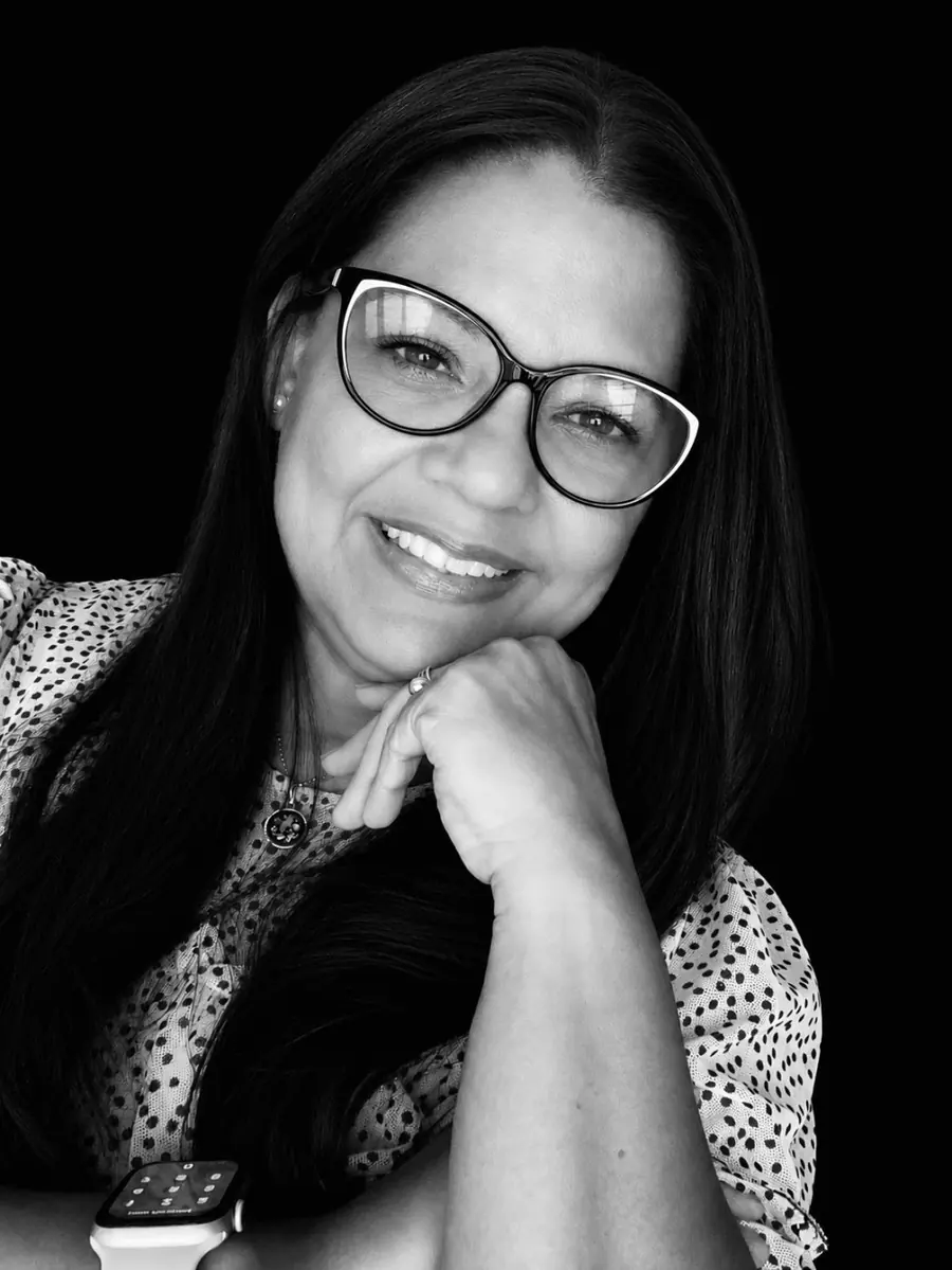
Nancy Cienfuegos is a brand strategist, creative director, art director and digital product creator. For more than 25 years she has shaped brands across corporate, startup, hospitality, travel and education, with travel and vacation as her home ground.
When you reach out, Nancy reads your message herself and follows up directly.
The first two cost you nothing. You decide about the rest once you've seen what Nancy sees.
Tell Nancy about your business and share your website or app. It takes about two minutes.
Nancy looks at it the way a first-time guest would and replies personally with what works, where people hesitate and what she'd fix first.
If working together makes sense, you get a clear scope and proposal before anything starts. If it doesn't, you keep the review.
Strategy, identity, website and app, built as one system and handed over with guidelines your team can use.

Send your website or app. Nancy will look at it the way a guest does, on a phone with other tabs open, and reply personally with three things:
No pitch deck. No obligation. If you never hire her, the review is still yours to keep.
You risk a few minutes. At worst, you see your own brand more clearly than you did this morning.
Takes about two minutes.
Claim your reviewSomething else on your mind? Put it in your message. Nancy answers every one herself.
Working and winning are different things. Your website is your brochure, your lobby and your front desk at once, and it's open to every guest who is comparing you with someone else.
The free review will tell you plainly whether it's pulling its weight. Sometimes the right answer is a refresh, not a rebuild.
Building the system first is what keeps a redesign manageable. Decisions about look, voice and structure get made once, so every page and screen after that moves faster.
Nancy leads the creative direction, so your team reviews and approves instead of art-directing.
Compare it with what a season of lookers who never book costs you, or with what you pay booking sites in commission every month.
Every project is scoped to what you actually need, from a focused refresh of your most important pages to a full brand and digital system. You'll see the scope before you commit to anything.
No. A good redesign keeps what guests already recognize and love, and replaces only what's holding you back. It can start with your identity and your highest-traffic pages, and grow from there.
Yes. Travel is where Nancy works most, and she has also built brands for startups, education and corporate teams. Trust works the same way in every industry: people choose what looks consistent and clear.
Nancy reads it herself and follows up directly, usually with a couple of questions and your First-Glance Review. No automated sequences, and no one passing you along to a sales team.
Make it an easy choice. Send Nancy your link and a few words about what you need.